Basic Layout in wxWidgets: the Flexibility of Simple Box Sizers
By Luke
Let’s talk about layout. It is a fundamental concept in any kind of UI programming, and designing desktop applications with wxWidgets is no different.
This is a companion post to the video tutorial I created some time ago. Check it out for a more detailed explanation and live demo of various sizers configurations:
Default Positioning
Layout is about arranging your UI elements on the window. While you can do it by specifying absolute positions, this is usually a bad idea. You want your controls to look good on varying frame sizes and want them to stretch and move when the user resizes the window.
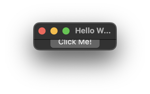
Let’s start with a very basic wxWidgets app:
#include <wx/wx.h>

class MyApp : public wxApp
{
public:
    virtual bool OnInit();
};

wxIMPLEMENT_APP(MyApp);

class MyFrame : public wxFrame
{
public:
    MyFrame(const wxString &title, const wxPoint &pos, const wxSize &size);
};

bool MyApp::OnInit()
{
    MyFrame *frame = new MyFrame("Hello World", wxDefaultPosition, wxDefaultSize);
    frame->Show(true);
    return true;
}

MyFrame::MyFrame(const wxString &title, const wxPoint &pos, const wxSize &size)
    : wxFrame(nullptr, wxID_ANY, title, pos, size)
{
}
What we have here are a simple application class and an empty main frame. That’s the least we need for a working desktop app that runs on all major platforms (Windows, Linux, and Mac).
Let’s add some controls, starting with a simple, colored panel. Put this code inside the MyFrame constructor:
auto panel = new wxPanel(this, wxID_ANY, wxDefaultPosition, wxDefaultSize);
panel->SetBackgroundColour(wxColour(200, 100, 100));
Passing this (which points to the MyFrame object) as the first parameter of the panel constructor makes it a child of the main frame. It also transfers the ownership of our panel to the wxWidgets framework. This means that we don’t need to call delete on the panel object, even though we constructed it using the new operator.
The wxID_ANY parameter indicates that we don’t care about our panel’s ID, and we let the framework generate it. The next two parameters specify the size and position of our control. We don’t put any absolute values there; we just use the default placeholders.
Interestingly enough, the panel fills up the whole window and stretches when the window is resized:
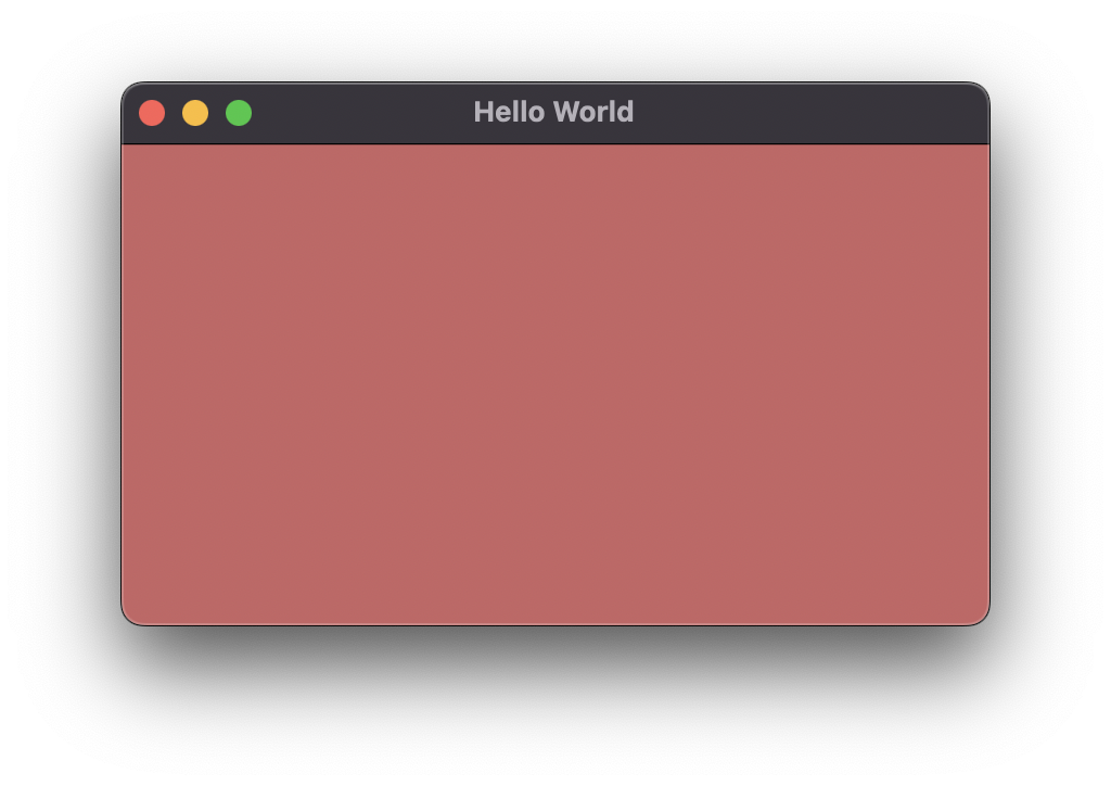
Single control auto stretching
This is because with just one control in the window, the framework does the stretching for us. If we add another control, even a simple button, the results are totally different.
auto panel = new wxPanel(this, wxID_ANY, wxDefaultPosition, wxDefaultSize);
panel->SetBackgroundColour(wxColour(200, 100, 100));

auto button = new wxButton(this, wxID_ANY, "Click Me!");
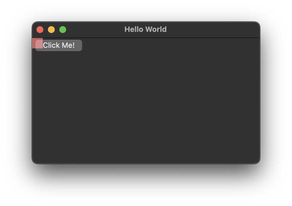
Adding a second control disables automatic stretching
Now there’s no stretching, and the controls retain their default sizes and positions. The framework no longer provides auto-resizing, and we need to code the layout rules ourselves.
We could apply absolute positioning simply by hardcoding the pixel values:
auto panel = new wxPanel(this, wxID_ANY,
                            FromDIP(wxPoint(10, 10)),
                            FromDIP(wxSize(200, 100)));

panel->SetBackgroundColour(wxColour(200, 100, 100));

auto button = new wxButton(this, wxID_ANY, "Click Me!",
                            FromDIP(wxPoint(10, 120)),
                            wxDefaultSize);
Two interesting things here. First, we wrap the pixel values in FromDIP calls. This ensures the sizes are correct on high-density displays on certain operating systems.
Second, we leave the button size as wxDefaultSize. The wxWidgets framework uses system-specific controls, so the buttons have different sizes on different platforms. We let it calculate the correct size depending on the target operating system.
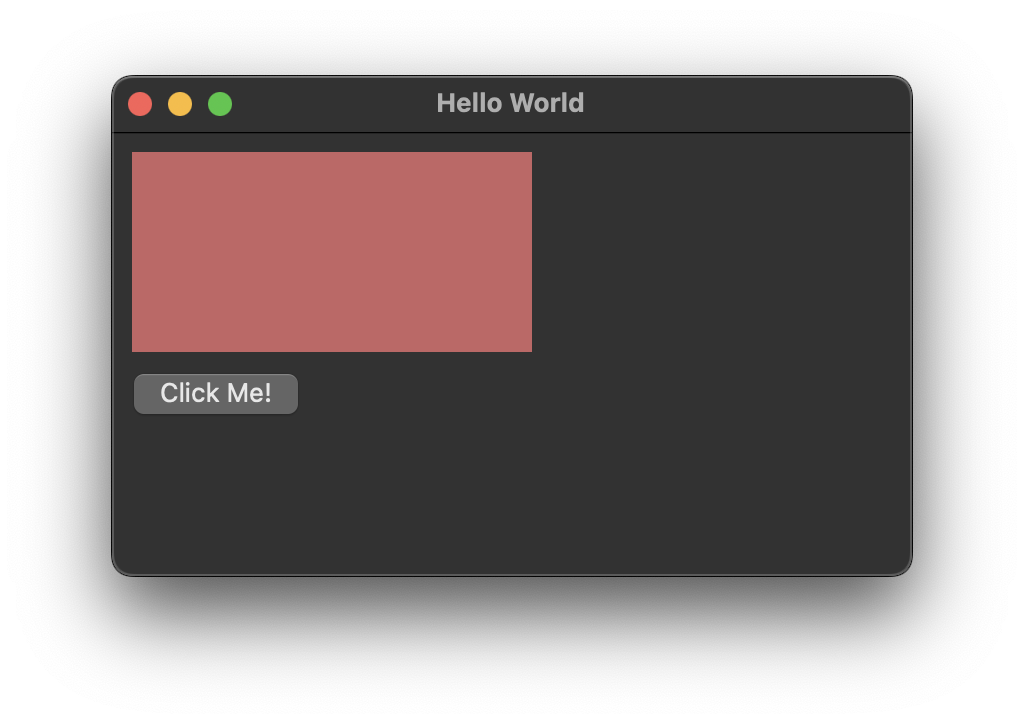
Absolute positioning
Not only do the controls not stretch when the user resizes the window (try it yourself!), but we also had to manually calculate the positions to get the 10px margins around the button, for example. This can be done in a much simpler way using sizers.
Introducing the wxBoxSizer
There’s a whole family of sizers, including wxBoxSizer, wxGridSizer, wxFlexGridSizer, and others. The box sizer, while being the simplest, is also the most commonly used, and a surprisingly large variety of layouts can be designed using this basic variant.
The usage for all sizer variants is basically the same: we create the sizer object, add the controls to it and set it to be the sizer of the parent control.
auto sizer = new wxBoxSizer(wxVERTICAL);

auto panel = new wxPanel(this);
panel->SetBackgroundColour(wxColour(200, 100, 100));

auto button = new wxButton(this, wxID_ANY, "Click Me!");

sizer->Add(panel, 1, wxEXPAND | wxALL, FromDIP(10));
sizer->Add(button, 0, wxALIGN_CENTER | wxLEFT | wxRIGHT | wxBOTTOM, FromDIP(10));

this->SetSizer(sizer);
With just these few lines, we get a nice-looking layout with margins and correct stretching behavior.
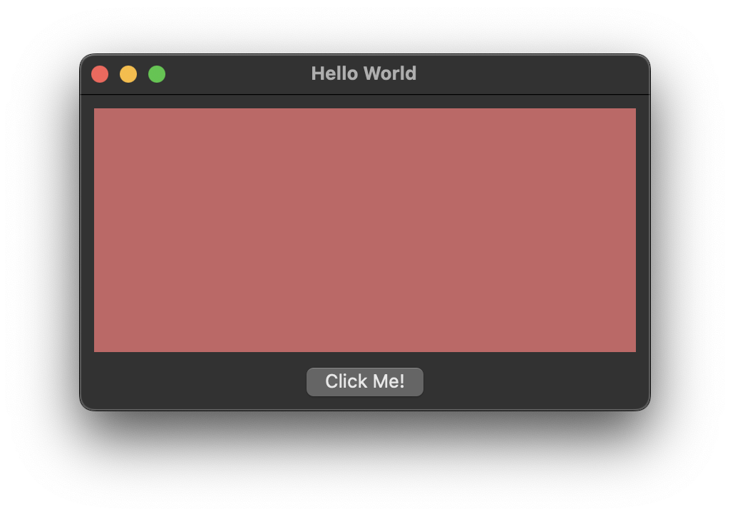
Basic box sizer
The framework provides even a little bit too much freedom for the user: they can resize the window to a ridiculously small and unusable size:
No size limits can be problematic
There are two ways to fix this. First, we can use SetMinClientSize at the end of our MyFrame constructor:
this->SetMinClientSize(FromDIP(wxSize(300, 200)));
Or set the panel’s dimensions from the start and then use SetSizerAndFit. This will resize the window to the minimum possible size (restricted by the panel’s size in our case) and ensure the user cannot make it any smaller.
auto sizer = new wxBoxSizer(wxVERTICAL);

// Here we set the panel size
auto panel = new wxPanel(this, wxID_ANY, wxDefaultPosition, FromDIP(wxSize(400, 250)));
panel->SetBackgroundColour(wxColour(200, 100, 100));

auto button = new wxButton(this, wxID_ANY, "Click Me!");

sizer->Add(panel, 1, wxEXPAND | wxALL, FromDIP(10));
sizer->Add(button, 0, wxALIGN_CENTER | wxLEFT | wxRIGHT | wxBOTTOM, FromDIP(10));

// note the "...AndFit"
this->SetSizerAndFit(sizer);
With either of these techniques, the minimum size will be maintained by the framework.
Exploring Sizer’s Parameters
But what do all these values we pass to the sizer’s Add method mean? Let’s take a closer look at the first call.
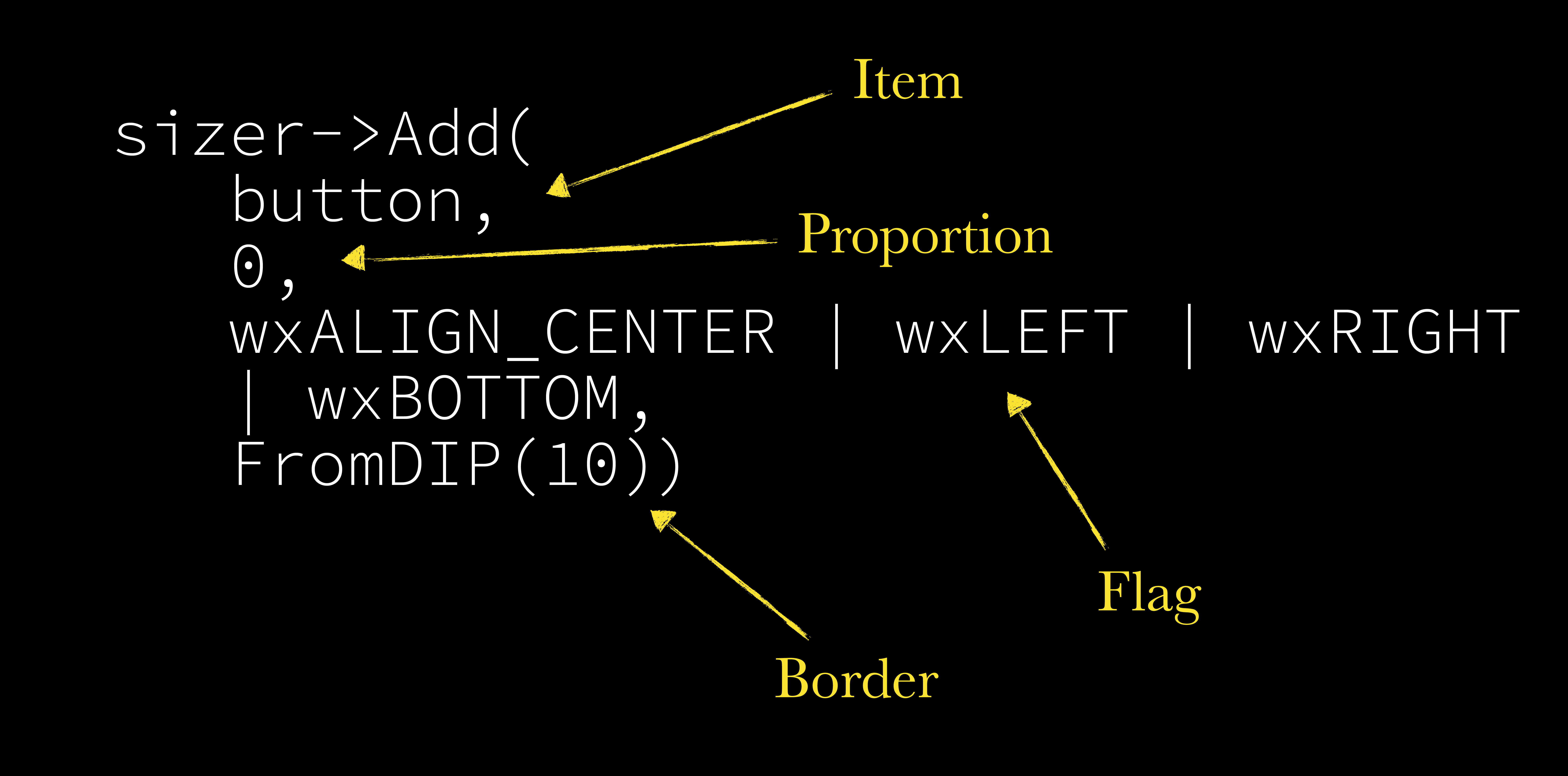
The anatomy of the Add method
Item
We obviously can add controls (i.e., classes which derive from wxWindow) to our sizers, but that’s not all. Other sizers can be added as well. This enables more possibilities, for example, centering vertically and horizontally, which we will explore later.
Proportion
This one is interesting. Specifying 0 indicates that we don’t want our item to stretch in the direction of the sizer. Any other value means the control will stretch in proportion to the total proportion value of all items added to that sizer.
So if we want one control to occupy 1/3 of available height and the other to fill up the rest 2/3, we can do it like this:
auto sizer = new wxBoxSizer(wxVERTICAL);

auto panel = new wxPanel(this, wxID_ANY, wxDefaultPosition, FromDIP(wxSize(400, 100)));
panel->SetBackgroundColour(wxColour(200, 100, 100));

auto otherPanel = new wxPanel(this);
otherPanel->SetBackgroundColour(wxColour(100, 200, 100));

auto button = new wxButton(this, wxID_ANY, "Click Me!");

sizer->Add(panel, 1, wxEXPAND | wxALL, FromDIP(10));
sizer->Add(otherPanel, 2, wxEXPAND | wxLEFT | wxRIGHT | wxBOTTOM, FromDIP(10));
sizer->Add(button, 0, wxALIGN_CENTER | wxLEFT | wxRIGHT | wxBOTTOM, FromDIP(10));

this->SetSizerAndFit(sizer);
The first panel is added with proportion = 1, and the other one with proportion = 2. The sum of these parameters is 3, so the first one fills 1/3 of the available vertical space, while the second one stretches to fill the remaining 2/3. Because we created our sizer with the vertical direction (auto sizer = new wxBoxSizer(wxVERTICAL)) all this stretching happens along the vertical axis.
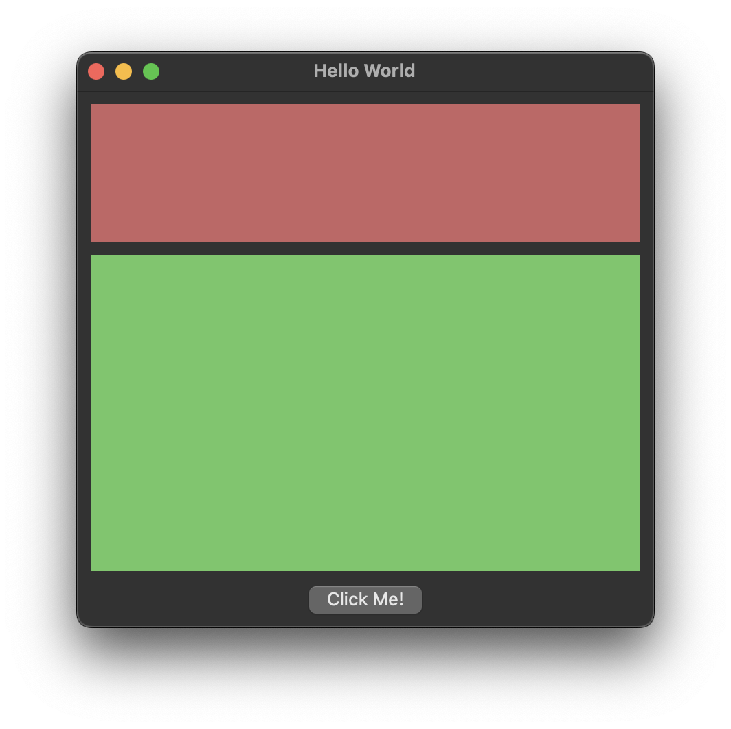
Using the proportion parameter
Flag
The flags in a box sizer serve two main purposes:
- They describe the element placement along the axis perpendicular to the box sizer direction,
- They determine which margins (borders) should be used.
The flags can be combined with the OR operator. So, “wxEXPAND | wxLEFT | wxRIGHT | wxBOTTOM” in our case means that we want the panel to stretch along the horizontal axis (remember, the sizer’s orientation is vertical) – that’s the wxEXPAND flag.
We then add the flags for the left, right, and bottom margins. We omit the top one because the control above uses the wxALL flag, so the spacing above our control is created by the previous control’s bottom margin.
Similarily, the “wxALIGN_CENTER | wxLEFT | wxRIGHT | wxBOTTOM” flags for the button use the left, right, and bottom margins and ensure the button is centered along the horizontal direction (wxALIGN_CENTER).
The full list of available flags can be found in the wxWidgets documentation: https://docs.wxwidgets.org/stable/classwx_sizer.html#wxsizer_flags.
Border
That’s the border or margin size. In our case we use 10 density-independent pixels everywhere to achieve a pleasant table-like layout.
Nesting Box Sizers
With clever nesting of the box sizers we can achieve a lot without ever needing to use more advanced wxSizer subclasses.
The controls inside our panel can obviously have the sizers of their own – that would be the simplest way to nest them.
auto sizer = new wxBoxSizer(wxVERTICAL);

auto panel = new wxPanel(this, wxID_ANY, wxDefaultPosition, FromDIP(wxSize(400, 250)));

auto list = new wxListView(panel);
list->InsertColumn(0, "Column 1");
list->SetColumnWidth(0, FromDIP(100));

for (int i = 0; i < 5; i++)
{
    list->InsertItem(i, wxString::Format("Item %d", i));
}

auto itemDesc = new wxStaticText(panel, wxID_ANY, "Here is a description of the selected item. \n\nIt can be as long as you want it to be, \neven spanning multiple lines.");

auto panelSizer = new wxBoxSizer(wxHORIZONTAL);
panelSizer->Add(list, 1, wxEXPAND | wxRIGHT, FromDIP(10));
panelSizer->Add(itemDesc, 2, wxEXPAND);

panel->SetSizerAndFit(panelSizer);

auto button = new wxButton(this, wxID_ANY, "Click Me!");

sizer->Add(panel, 1, wxEXPAND | wxALL, FromDIP(10));
sizer->Add(button, 0, wxALIGN_CENTER | wxLEFT | wxRIGHT | wxBOTTOM, FromDIP(10));

this->SetSizerAndFit(sizer);
This example adds a list control (remember to #include <wx/listctrl.h>!) and a description to the panel. This time we added our new sizer to the panel, not the main frame, effectively nesting the sizers and providing a pleasant auto-sizing behavior.
Adding Sizers to Sizers
Actually, if the only purpose of our panel is to manage the auto-resizing of the controls, then we don’t need it at all. We can add the controls to the main frame, create a separate sizer for them, and add that sizer to to main sizer (as opposed to adding the panel to the main sizer).
auto sizer = new wxBoxSizer(wxVERTICAL);

auto list = new wxListView(this);
list->InsertColumn(0, "Column 1");
list->SetColumnWidth(0, FromDIP(100));

for (int i = 0; i < 5; i++)
{
    list->InsertItem(i, wxString::Format("Item %d", i));
}

auto itemDesc = new wxStaticText(this, wxID_ANY, "Here is a description of the selected item. \n\nIt can be as long as you want it to be, \neven spanning multiple lines.");

auto listPickerSizer = new wxBoxSizer(wxHORIZONTAL);
listPickerSizer->Add(list, 1, wxEXPAND | wxRIGHT, FromDIP(10));
listPickerSizer->Add(itemDesc, 2, wxEXPAND);

auto button = new wxButton(this, wxID_ANY, "Click Me!");

// adding a sizer directly to another sizer
sizer->Add(listPickerSizer, 1, wxEXPAND | wxALL, FromDIP(10));
sizer->Add(button, 0, wxALIGN_CENTER | wxLEFT | wxRIGHT | wxBOTTOM, FromDIP(10));

this->SetSizerAndFit(sizer);
Centering Controls in Both Directions
One of the common but tricky tasks involving nested sizers is centering a control both horizontally and vertically. This can be achieved with two Box Sizers like this:
auto verticalSizer = new wxBoxSizer(wxVERTICAL);
auto horizontalSizer = new wxBoxSizer(wxHORIZONTAL);

auto panel = new wxPanel(this, wxID_ANY, wxDefaultPosition, FromDIP(wxSize(400, 300)));
panel->SetBackgroundColour(wxColour(200, 100, 100));

horizontalSizer->Add(panel, 0, wxALIGN_CENTER);
verticalSizer->Add(horizontalSizer, 1, wxALIGN_CENTER); // Note the proportion!

this->SetSizerAndFit(verticalSizer);
First, we add the panel to the horizontal sizer. The proportion is set to zero, meaning the panel won’t stretch horizontally. It will center in the perpendicular direction, however, thanks to the wxALIGN_CENTER flag.
If you think about it, this means that the horizontal sizer will handle centering the item vertically. Now we need a vertical sizer to center the panel horizontally.
The interesting thing here is the proportion parameter being set to 1. If we set it to 0, there would be no stretching along the verticalSizer’s axis, and the panel would stay on top (try it yourself). But because we set the proportion to 1, we “stretch” the horizontalSizer vertically, allowing it to center the panel in the vertical direction.
Conclusion
In this post, we explored the basics of UI layout in wxWidgets. We introduced an absolute layout, progressed to automatic sizing, and explored the intricacies of the wxBoxSizer.
This simple class can be very useful for both simple user interfaces, as well as more advanced ones, thanks to the ability to nest the sizers. If you want to know more about this topic, I encourage you to watch the video mentioned in the introduction, and subscribe to my YouTube channel for more programming content.