Navigating Grid Sizers in wxWidgets: From Basics to Flexibility
By Luke
Welcome to our practical exploration of wxWidgets’ Grid Sizers. Building on our previous tutorial on layout basics, today we’re venturing into the more advanced realms of the simple Grid Sizer and the Flex Grid Sizer. Through concrete examples – a checkerboard pattern and a functional signup form – we’ll demonstrate the power and nuances of these layout tools.
Part 1: The Simple Grid Sizer - Building a Checkerboard
Let’s start with the simple Grid Sizer, perfect for uniform layouts. Our first task is to create a checkerboard pattern, which will help us understand the basic functionality of Grid Sizers.
Code Example: Checkerboard Pattern
const int WIDTH = FromDIP(30);
const int HEIGHT = FromDIP(30);

const int COLS = 20;
const int ROWS = 13;

auto sizer = new wxGridSizer(ROWS, COLS, 0, 0);

for (int i = 0; i < ROWS; i++)
{
    for (int j = 0; j < COLS; j++)
    {
        auto square = new wxPanel(this, wxID_ANY, wxDefaultPosition, wxSize(WIDTH, HEIGHT));
        bool isDark = (i + j) % 2 == 0;
        square->SetBackgroundColour(isDark ? wxColor(80, 80, 80) : *wxWHITE);

        sizer->Add(square, 1, wxEXPAND);
    }
}

this->SetSizerAndFit(sizer);
Result: Checkerboard Pattern
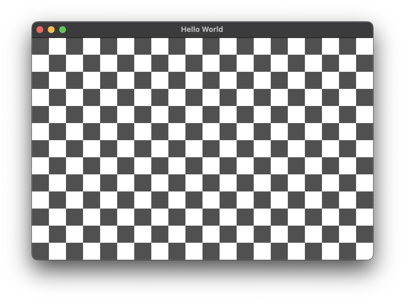
Basic grid sizer
The grid sizer evenly distributes the panels, creating a clean and uniform checkerboard pattern, demonstrating its efficacy for regular, grid-based layouts.
Part 2: Transitioning to Flex Grid Sizer - A Signup Form
While the simple Grid Sizer is great for uniform layouts, it lacks the flexibility needed for more complex designs like a signup form. Here, elements vary in size and stretching behavior, which calls for the more adaptable Flex Grid Sizer.
Code Example: Signup Form
enum class InputType
{
    SingleLine,
    MultiLine
};

// ...

std::vector<std::pair<wxString, InputType>> form = {
    {"Name", InputType::SingleLine},
    {"Address", InputType::MultiLine},
    {"Phone", InputType::SingleLine},
    {"Email", InputType::SingleLine},
    {"Notes", InputType::MultiLine}};

const auto margin = FromDIP(10);

auto mainSizer = new wxBoxSizer(wxVERTICAL);
wxPanel *panel = new wxPanel(this, wxID_ANY);
this->SetBackgroundColour(panel->GetBackgroundColour());

auto sizer = new wxFlexGridSizer(form.size(), 2, margin, margin);

sizer->AddGrowableCol(1);

// set growable row for multiline input
for (size_t i = 0; i < form.size(); i++)
{
    if (form[i].second == InputType::MultiLine)
    {
        sizer->AddGrowableRow(i);
    }
}

for (const auto &[label, type] : form)
{
    auto labelCtrl = new wxStaticText(panel, wxID_ANY, label);
    sizer->Add(labelCtrl, 0, wxALIGN_CENTER_VERTICAL);

    auto style = type == InputType::SingleLine ? 0 : wxTE_MULTILINE;
    auto inputCtrl = new wxTextCtrl(panel, wxID_ANY, wxEmptyString, wxDefaultPosition, wxDefaultSize, style);

    sizer->Add(inputCtrl, 1, wxEXPAND);
}

sizer->SetMinSize(FromDIP(400), wxDefaultSize.GetHeight());
panel->SetSizer(sizer);

mainSizer->Add(panel, 1, wxEXPAND | wxALL, margin);
this->SetSizerAndFit(mainSizer);
Result: Signup Form
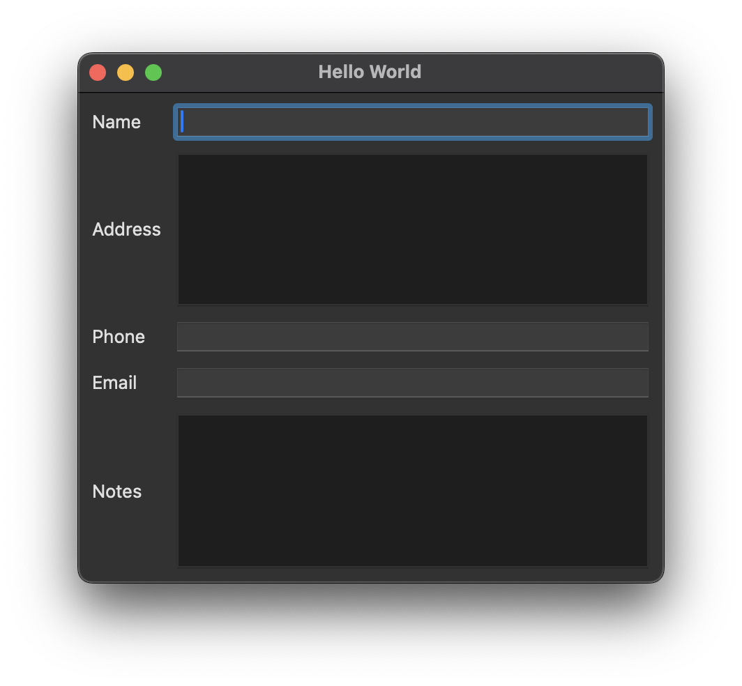
Flex Grid Sizer with stretchable Text Fields
The Flex Grid Sizer allows for differential sizing and stretching of elements. Labels remain fixed, while input fields adjust in size, creating a form that’s both aesthetically pleasing and functionally robust. All that thanks to the AddGrowableRow and AddGrowableCol calls strategically placed in the code above.
Conclusion
Today’s journey through Grid Sizers in wxWidgets has equipped us with the knowledge to choose the right tool for the right job. The simple Grid Sizer excels in uniform layouts, while the Flex Grid Sizer offers the versatility needed for complex, varying designs. Dive into these examples, available in our GitHub repository, and harness the full potential of wxWidgets in your UI projects.
For more detailed insights and a visual guide, watch our in-depth video on Grid Sizers: